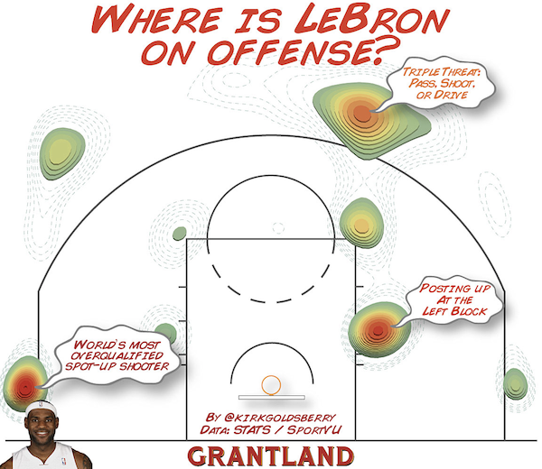
A clinic in figure design
Posted in Tips
You don’t have to be an APBRmetrician to appreciate the graphics Kirk Goldsberry puts together from his analysis. They’re clear, the data-to-ink ratio is high, and there are appropriate annotations to help tell the story.
Previously on Labrigger: Visualizations

I’d say without a color scale bar this figure can mean almost anything you want it to mean.
Yes, it needs a color scale bar. True.
It’s also a bit lame without context. This single image doesn’t tell the whole story, the original article shows lots of comparisons like this:
http://a.espncdn.com/photo/2013/0327/grant_i_LeBronClusterChange0910-1011.jpg
(which also needs scale bars)
if only journals and reviewers were not so set on staid figure layouts
Agreed. Original research reports are typically kept pretty staid. Perhaps reviews are where one will get a bit more latitude on figure design. Even then though, they might not be thrilled about having LeBron James’ headshot in the corner.
Annotations I like, and I’d like to see them used more often.
I don’t like 3D effects like shadows on 2D data (e.g., bar graphs), so I don’t care for that aspect of this graph.