2p Calcium Imaging Fidelity
Posted in Tips
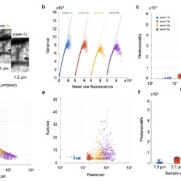
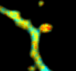
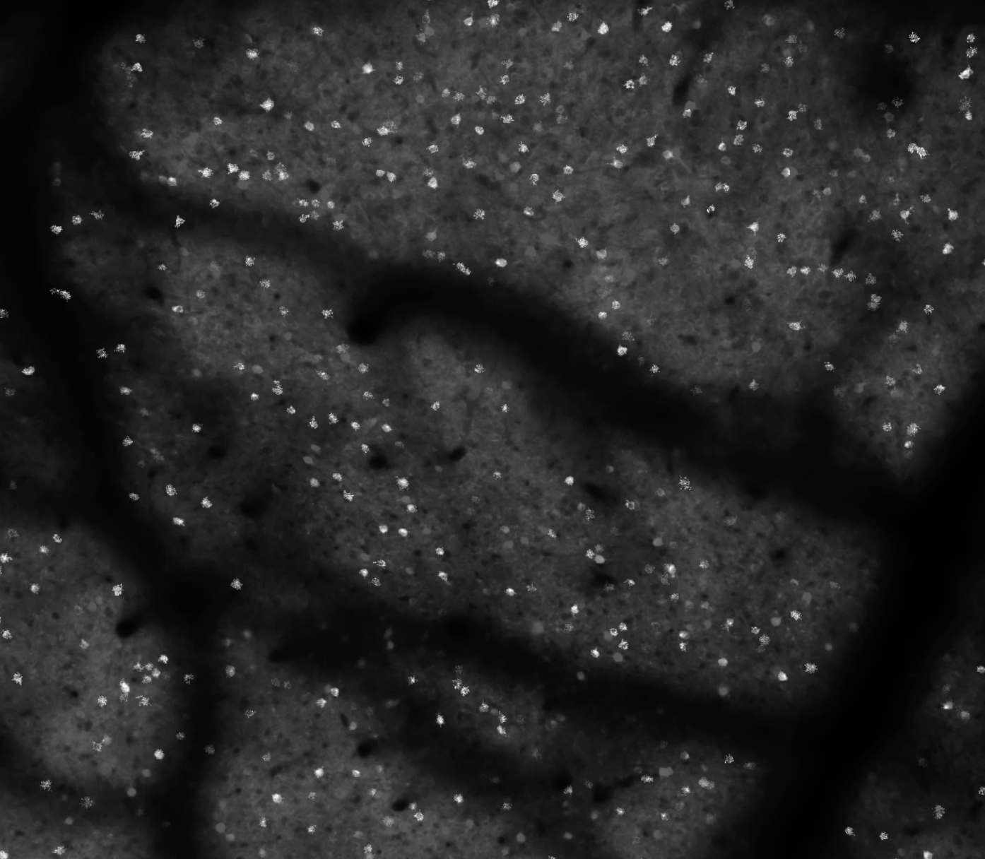
As you all know, if you have a small field-of-view (FOV), you can often get better quality data than with a larger FOV. Dwell times per pixel are higher, more pixels per cell, higher frame rates, and ultimately more photons per second per neuron. That’s…


