Headplate designs
Posted in Hardware
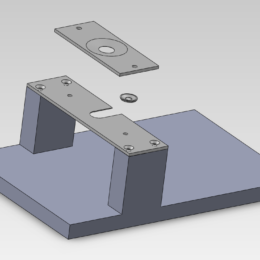
Multiphoton imaging with micron resolution in living animals can be challenging…
Multiphoton imaging with micron resolution in living animals can be challenging…

LabMaker sells parts, kits, and assemblies for open source neuroscience tools, including the UCLA MiniScope and Crystal Skull “coverslips”.
…

I came across Rachel Thomas’ comments on blogging in the context of machine learning, and they’re good. I’ve been telling people things like this for awhile now and Rachel distills them better than I…
SLAB is trying something new with one project in the lab. Prior to drafting a preprint, we’re blogging the project and sharing the results and analysis. We invite anyone to comment…

In the past, Labrigger has only rarely posted about relevant papers. That ends today. Now there’s a new post category for papers, and it’ll be used to highlight publications that are of potential interest to…
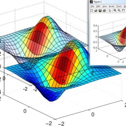
Getting nice figures out of MATLAB can be a challenge. Sometimes it’s fine, but if you’ve hit upon a figure that simply isn’t exporting nicely (bad vector rendering, lost transparency, etc.), check out the…
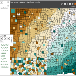
Colorbrewer was designed for cartography, but is useful for figure color schemes and look up tables (LUTs). The web interface is slick, offers an immediate preview, and the look up table can be exported….
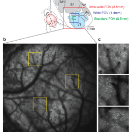
In this preprint, Stirman et al. report achieving a 3.5 mm field of view with 2-photon excitation with cellular resolution. The design involves custom scan optics and a custom objective built in the…
Parula is the new default colormap for MATLAB (namesake above, actual map below). It probably collapses to grey better than jet (which is good for colorblind readers).
You aficionados care dearly about…

If you like Labrigger, you should register for this Short Course at the SfN meeting.
Short Course #1: Advances in Multineuronal Monitoring of Brain Activity
Spencer Smith will be talking about the work…
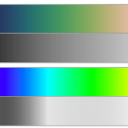
Cubehelix is a color scheme that retains contrast as it is desaturated (top), as opposed to a more typical rainbow scheme (bottom). It’s great for look-up-tables (LUTs).
Dave Green’s web site has multiple…
Don’t be shy.
If you have a tip to share, however small or big, please do so using the new link above.
You can do it anonymously, if you like. Or you can…
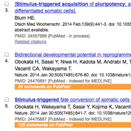
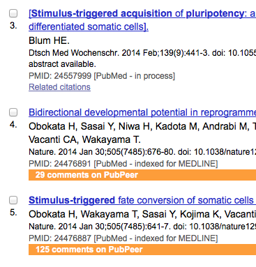
PubPeer has released browser plugins that add a line to PubMed results if there are comments on PubPeer for those publications. It looks like the example above. The install took less than 10…

Creative Commons‘ science section has an easy-to-use web page that generates a PDF form you can attach to the publisher’s copyright form to ensure you reserve certain rights.
Previously…
Most scientists have adopted minimalistic design principles for graphs. We still sometimes see 3D bar charts, but it’s rare. Data tables are another story. Sometimes journals take the formatting of data tables out of the hands of the authors. Perhaps they recognize that it’s…