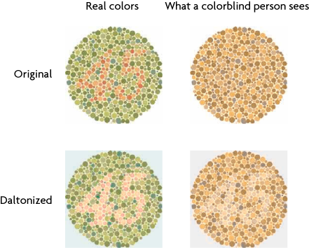
Daltonize your figures for the colorblind audience members
Posted in Tips
I’m revising figures for a paper right now and the editors suggested I avoid red-green color schemes. In the US, 7% of men are colorblind, usually red-green colorblind. The editors suggested this great site. In addition to some good information, the site has an online app which implements an algorithm that recolorizes full color figures in order to enhance the contrast for red-green colorblind people. They dubbed the procedure “Daltonization”, for John Dalton, the fellow who first published on color blindness in 1798. It makes sense to do this for slide presentations and posters too, not just papers.

Check out http://daltonize.org/ – the website goes more into depth on the code behind daltonization, other implementation (there are various algorithms) and a Google Chrome extension 😉
[…] This is problematic since red-green colorblind people cannot tell what is going on. Following up on the recent post on Daltonization, here’s a colorblind-proof color scheme for showing co-localization. It uses a standard […]