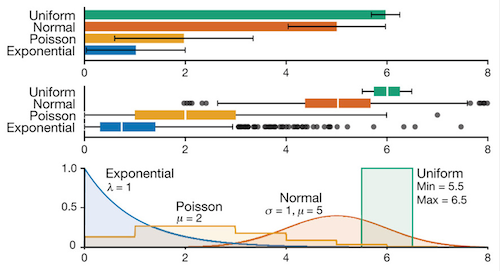
Box plots vs. bar charts
Nature Methods has a special on box plots, and in particular, the web app BoxPlotR.
Box plots are great. However, the conventions for box plots are not completely uniform (see below), and that can lead to confusion and make it take longer for a general audience to interpret the graphical representation of the data and understand the story it tells. And furthermore, it’s usually pretty simple to supplement a humble bar chart (mean +/- standard error or standard deviation) with a plot of all of the data points, so the reader can see the distribution. In 1969, when Tukey came up with the box plot, we didn’t have the fast and powerful graphing tools that we have today. Even in the cases of large sample sizes, where it’s not practical to plot every point, a histogram can still provide more visual information than a box plot. For example, if the distribution appears bimodal, this is immediately obvious in a histogram, but not so in a box plot (nor a bar chart, of course).
What do you think?
Some features of box plots are always the same, others aren’t
Center bar
Always the median.
Top and bottom of the box
Always the first and third quartiles.
Whiskers
Sometimes the max and min values, sometimes some extreme percentiles (e.g., 9th and 91st, or 2nd and 98th percentiles) to exclude the influence of extreme outliers, sometimes the whiskers are based on standard deviation, and sometimes none of the above.
Data markers
Related to the whiskers, if there are data points outside of the whiskers, they are sometimes drawn in the box plot, but sometimes not. And sometimes they’re outliers, and sometimes they’re just the extreme tails of the sample.
Width
Sometimes the width of the box plot is used to indicate sample size, sometimes not.
Notches
Sometimes notches are used to give a visual cue as to the potential significance for the difference between two means, sometimes not. However, the actual math behind the notches, is not as trivial as looking for overlapping standard error bars, which serves a similar purpose. Neither is perfect of course, but it’s easy to see the appeal of the simpler solution.

Actually, the middle bar is by definition the median.
And our lab loves box plots since we use nonparametric stats nearly all the time due to our non-normal distributions. It’s just easier that way. Less robust, but also less prone to outliers influencing our data.
re: median– Thanks for catching that. I changed it in the post.
Do you prefer box plots because your data is not normally distributed? How about just plotting histograms of the data?
Our data are rarely, if ever, normally distributed (damn biology…), so we often do it for that reason.
In all honesty, we could use histograms more frequently than we do, but for complex data arrays we find them to be more hassle than they are worth. A well defined box plot is a very nice way of visualizing summary data.
The purpose of box plots is not just to save work but to synthesise data. How would you compare 5 non normal distributions if you have all the data points or five histograms in a graph? Sometimes it is necessary to summarize.