Visualizations

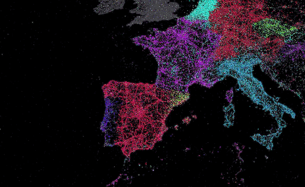
Visual.ly recently posted a list of the top visualizations of 2011. This is a map of the world in which Twitter tweets are plotted using their GeoIP info and color-coded based on language. Looks cool, but there is no message. I could have guessed how this map would look. Germans tweet in German, Brazilians tweet in Portuguese, and so on. Big urban centers have a lot of tweets. Developing economic areas and sparsely populated regions don’t. I don’t see anything interesting. And so many of the colors are difficult to distinguish, if there is any new information, it’s difficult to figure out. They should have added more text labels on the map to identify languages near where they are found. Really? This is #1 on the list?
The field of data visualization is not well defined. The comeliness of a visualization is important, but if there is nothing revealed by the visualization– no story told– then it fails. There seems to be quite a number of people who enjoy studying data visualization who are almost purely interested in the aesthetics. This makes it difficult to really get good advice. A recent book review in Science by Robert Kosara seems to be wrestling with this issue. Two books are covered, Yau’s Visualize This, and Lima’s Visual Complexity. The former is a practical guide to creating effective visualizations, the latter is a collection of breath takingly beautiful works of art with no apparent message. Kosara notes that Lima “never attempts to explain what viewers can learn from any of the examples.”
Tufte has already said much of what needs to be said about data visualization. For example: “Have a message.” “No chart junk.” “Maximize the data-ink ratio.” Tufte himself said of Lima’s book, “One useful question to ask of each image is: What did I learn from this, in addition to seeing an elegant architecture?”
Yau does an excellent job following Tufte’s principles. He has a website that is worth checking out, flowingdata.com. And don’t forget Tufte’s own website. Junk Charts is good too. It just posted this holiday Venn diagram:

[…] Previously on Labrigger: Visualizations […]
[…] Visualizations Color-coding terms Color schemes […]
[…] More on Visualizations […]