Bill Gates’ Graph of the Year
Infographic by Thomas Porostocky for WIRED.
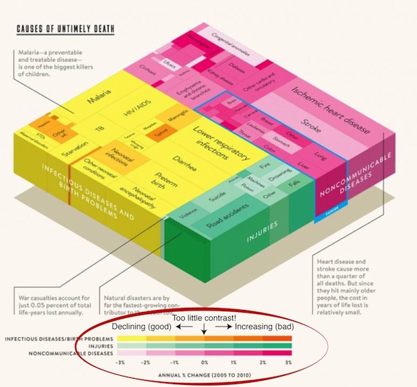
Of course Labrigger emphatically supports the work of the Gates Foundation. However, we have to disagree with Bill Gates’ choice for Graph of the Year. Topic, content? No problem. Coloring? Obscures the whole message.
Note that the color scale covers from -3% to +3%, and the contrast as we pass the zero-change point is no greater than it is anywhere else on the color scale. Maybe this is intentional because of large error bars, but we’re guessing it’s not. We get Gates’ point, that the fraction of deaths due to infectious diseases is declining, but for many of the portions of that graph, I can’t tell. Is the fraction for typhoid increasing or decreasing? How about for meningitis? This graph could be used to demonstrate Mach Bands, and that’s not a good thing for clarity.
The other aspects of the graph are excellent. In particular, I like the call-outs/annotations. A lot of the other selected graphs are quite good.
Previously
Visualizations
Color-coding terms
Color schemes
Daltonize
Not to mention gratuitous 3-dimensionality…