Taro Tools and PPT for Igor Pro
Last Friday afternoon to Saturday morning I had a marathon data analysis session. It was almost completely in Igor Pro. I used TaroTools so heavily that I dropped Taro another thank you note. It’s really saved me so much programming and analysis time. I highly recommend checking it out. Prof. Ishikawa keeps it up to date (last update, May 2011), so it’s not abandonware.
The last time Labrigger covered Igor Pro software for electrophysiology, TaroTools, Neuromatic (last update was in 2008, but it has aged fine and is still very handy), and PPT were all mentioned. However, there weren’t any PPT screenshots, nor was there much information. In this post, I’ll highlight it in a bit more detail.
PPT (Patcher’s Power Tools) was developed in Neher’s lab (download, about). It’s development has perhaps slowed, but is still regularly updated (last update was March 2011). After installing, it adds a PPT menu to the Igor menu bar.

As you can see, it’s built to load in HEKA data files, but the later entries are very general purpose. “Wave Statistics”, despite the similarity in name, is actually not like the native command WaveStats at all. It’s actually a very fast and easy-to-use wave average function. Feed in some waves, and get the mean, SD, and SEM out.
“Plot Waves” plots selected waves, but instead of Igor Pro’s default plotting with all the waves sharing the same y-axis, each wave is plotted on a separate y-axis, stacked vertically, against the same x-axis. “Slim Waves” downsamples waves, which I’ve learned is very important for making nice looking figures. If you have several seconds of data sampled at 50 kHz and then shrink it down to just an inch wide, you quickly run into resolution limits and data points that should be right next to each other end up on top of each other. Here’s what it looks like:

The top trace is at full resolution: 50 kHz sampling. The trace below it is down sampled 10-fold. Note that the non-downsampled trace looks strange and hairy. Now zoom in some more and select the traces.

Note that the non-downsampled trace (top) has sample points sharing the same x-coordinate. This is because we’ve run into resolution limits. The downsampled trace looks fine. Downsampling is important for figure presentation not only because it makes the traces look nicer, but it makes the PDFs load faster too. If you ever grow annoyed at how long it takes your PDF reader to draw a figure with traces, it’s because the authors didn’t down sample when they should have. I’ve seen PDFs from journals that are over 30MB. BTW- the traces can easily be extracted from the PDF. So in way, it’s an inadvertent combination of publishing and data-sharing.
The next four entries on the PPT menu are all very handy calculators.

A calculator for reversal potentials.

And here’s one for computing the liquid junction potential.
There’s more too. In addition to the calcium imaging tools seen in the PPT menu above, there are also utilities for Boltzmann fits, dose-response curves, Fura calibration, and more. All in all, this is a really handy set of utilities to have around. Even if you don’t typically use Igor Pro for analysis, PPT, NeuroMatic, and TaroTools may be handy enough to justify having a copy.
Yea, PPT offers some nice extra tools for electrophysiology, however, I find it somehow a little strange that the liquid junction potential calculation tool it offers don’t have enough space for me to input every ion in my solutions.
[…] was in Tokyo recently and stopped by my friend Taro Ishikawa’s lab (of TaroTools fame). He and Misa are doing very well. They have exciting work underway and are expanding their […]
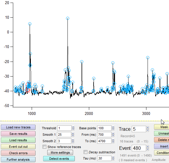
[…] the topic, at a recent lab meeting, Taro Ishikawa’s Taro Tools event detection code for Igor Pro came up again. It’s a very versatile set of code, and […]
CSHL course recommended your procedure file for data analysis!
Thank you!
Yevgeniya